Patrick Rhone’s new blog focused on minimalism and how to achieve it on the Mac platform has gotten me thinking on this subject once again. I love this concept, but I prefer to think of it in this way—simplicity. Use only what you need.
With all the great software released every day, this can be a hard ideal to live up to. Especially for someone like me, who loves to tinker. But I think I’ve made some progress in this area over the past couple of years. Once you recognize and admit to you habits, you can start to address them.
Back to Patrick’s blog: I recently submitted some thoughts of my own which he kindly posted. I thought I would share here as well1.
There are two tools which I use regularly to keep my screen clean and clutter free. They are Hazel and Witch—I’ve talked about them before, but not in the sense of simplicity. How do I use them? Hazel allows me to keep my desktop free of clutter and Witch keeps my screen clean with minimal windows in view.
Hazel
If you read through the posts on MinimalMac, especially the user submissions, you’ll find that a lot of people want to keep their desktop free of icons, files or other types of digital detritus. I’m the same. Hazel enables me to keep everything off the desktop and have peace of mind that nothing will get forgotten.
This application basically lets you create rules for files or folders that automate certain actions to take place if the criteria you set are met. Here’s how the developer describes the tool:
Automated Organization for your Mac.
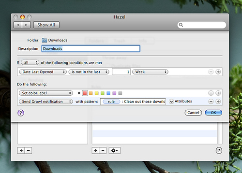
Simply put. And it’s a fairly simple tool. I use it to monitor three folders: the default Downloads folder that’s a part of each user account in OS X, as well as two folders in my Dropbox that I named Pending and Working. Each folder has certain rules set to notify me when things are getting stale. You can see this from the rule shown here.
I created a rule to manage the Downloads folder.
An example of my usage is when I’m working on a post. I take a good number of screenshots, which are saved to the desktop. Then I use Quicksilver to move those files to the Working folder. I’m often not ready to complete the post at this time, but I can move on. My desktop is clean and if those files sit in the Working folder for more than a week, Hazel sends a Growl notification and adds a colored label to each file.
Witch
This gem of a tool gives you better control of your application windows. OS X’s default CMD + Tab gives you a nice way to move between open applications, but it simply does not manage your application windows. Witch does. The Witch website answers the question as to why you would want to use this app:
Have you ever wanted to switch back and forth between windows that don’t belong to the same application? If so, Witch is for you.
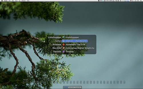
Again, on the MinimalMac blog, there has been some content regarding keeping your screen free of open windows. I also have this habit. I manage using Witch. The nice thing about this tool is that it gives you the ability to switch to a window that is currently hidden. See in the screen below how there are no open windows, yet Witch gives me four windows to choose from.
Witch extends the OS X windows management.
My habit is to hide any window that I do not want to currently work in, but that I do not want to go away. Propane is a good example: if I was to close the window, I would then exit from the Campfire chat room. I don’t want to leave the room, but I don’t want the Propane window on the screen all the time either.
Therefore I hide my windows and then use my Alt + Tab shortcut to activate Witch and choose the window I want to move to. Another plus here — my hands never leave the keyboard.
There are so many ways to smooth and de-clutter your workflow, especially on OS X. These are two ways that I do it and I’m confident that I’m more productive for it.
Seeing as I haven’t posted in sooo long [↩]
Written and Produced by Chris Bowler
The Weekly Review is the work of Chris Bowler, software enthusiast.
Good design is something to be appreciated, whether on the web or in the software you use everyday. This space is dedicated to discussion on those ideas.
Thanks to a list post (yes, a list post) on Smashing Magazine, I came across a great new tool today called Dateline. Normally I would not deem one day of usage as a candidate for A Great Moment, but it’s easy to predict that this app is going to stay on my desktop for a long time.
As long as I have used OS X, I have used various methods to display the date on my desktop. With Leopard, iCal now shows the current date in the Dock icon, but I hide my Dock. Not a good option. I’ve used various tools in the menubar, but they usually take up too much of the precious horizontal space. I’ve also used Awaken on the desktop to display the date.
But none of those solutions as been as good as DateLine. The great moment here—it’s the perfect solution for the need. It gorgeously displays the date on your screen. Simple as that.
It has a few options—you can change the color schemes, window behaviour, and the width. But aside from that, and the fact that clicking on a day opens iCal to that day, it has no features.
Now that WWDC is past and all the Mac developers have settled back in at home, there should be a good bit of content this week focused on the updates Apple unveiled during the conference. For the most part, there was nothing truly shocking.
As they have the past couple of years, Apple’s updates were focused on gradual improvements to their existing lineup. Here’s what got my attention.
Snow Leopard Enhancements
Although Snow Leopard is lacking in new features, there are a few updates to current applications within the operating system that are interesting enough to mention.
The Finder
It seems that users either hate the Finder or are indifferent to it. How many times have you heard someone say, “I love the Finder”? Yeah, me neither.
If you were looking for Apple to finally overhaul this particular window to the file system, you’ll be disappointed. From the descriptions, it sounds like Apple put a little more spit and polish on the Finder, but nothing substantial. Indeed, the biggest changes may be under the hood with the reliance on the new GCD (Grand Central Dispatch). Speedier performance is usually a useful improvement, but I’ve never had a lot of issues with having to wait for the Finder.
Update: My partner in crime called me out on the Finder. It has been rewritten in Cocoa and makes use of the newer technologies of Snow Leopard, resulting in faster performance. But the UI is what remains the same, which is the big complaint people have with the Finder. So I think my point stands.
All in all, it looks like discerning judgement cannot be made until we get a chance to use it (which is always a good practice anyways).
The Dock
Stacks appear to be much more useful in 10.6
The Dock received some significant attention, mostly in the form of additional functionality for the Stacks and Spaces/Expose integration. The updates to Stacks seems like a natural progression as they were only introduced in Leopard (10.5) and focus on navigation.
The most interesting update to me is the Expose activation. It’s hard to picture exactly how this can be used without seeing it in action, but the description on the Apple page linked above sounds very appealing:
Click and hold an application icon in the Dock, and all open windows in the application you selected will unshuffle so you can quickly change to another window. Press the tab key while in Exposé to move to the next application in the Dock and show the windows for that application. Minimized windows appear as smaller icons below the other windows. And windows are spring-loaded, so you can drag and drop items between windows.
I use Witch for switching windows as described here, but the ability to only see windows for a specific application and then easily move from one app to another is very appealing. As does the ability to drag and drop items between the windows.
QuickTime X
Another significant update is the overhaul of QuickTime. Correct me if I’m wrong, but this is basically a rebuild of the application and removes the distinction between QuickTime and QuickTime Pro.
QuickTime 10 adds interesting new features.
The ability to easily capture and edit movies makes this a consumer level video package. Ease-of-use and a focus on sharing media on the web and handheld devices make this another example of Apple’s vision to be the primary media provider/handler for the average family.
The other addition here that got my attention was the screen recording feature. This is a space that is already popular with many third party developers. Like other updates in the past, some of these developers will struggle because of this addition to the operating system. But, as with those additions, I assume that the QuickTime screen recording feature will be consumer level, meeting the needs of the family but not those of the screencasting professional.
Mail/iCal
The biggest news here is the addition of full support for Microsoft Exchange. Apple continues to chip away at the perception that their products are not suitable for the enterprise. Again, it’s hard to say how good the integration with Exchange will be until we see it in action, but from the description given, it sounds full fledged.
Other updates that are noteworthy are the reorderable sidebar, text substitution, and the GMail/Yahoo calendar integration.
Other Miscellaneous Updates
There were a smattering of other mentions that I’m looking forward to. The availability of the multi-touch gestures for older laptops is a good addition. New starting points for Automator will hopefully be useful, as will the split-pane view for Terminal. I also look forward to the four new fonts in the system and being able to display the date in the menubar.
Small items for sure, but they add to the overall experience.
When you look at the overall list of updates for Snow Leopard, even though there are no new ‘features’, you see improvement overall. As they have been so good at over the past decade, Apple is systematically improving their product offerings across the board. And Snow Leopard is just another step in that process. Whether it’s the iTunes store, their hardware lineup, the iPhone OS, or the Mac OS, Apple has taken a dogged approach to gradually improving each product, adding new features at times and simply some spit and polish at others.
With Snow Leopard, the end result is the most solid, stable, and user friendly operating system available.
Safari 4
I have to say that I was happy with the Safari 4 beta. Although there were a few controversial changes, it was so fast and polished that I was happy using it as my primary browser—on both OS X and Windows XP. So I was surprised when I discovered that the official release of Safari 4 was even better. The browser is so slick in many ways. Here’s what impressed me.
Speed
The browser is fast. Really fast.
Progress Meter/Stop and Reload Buttons
In a way, these are two separate features. They were also two that were highly criticized in the beta period. But in Safari 4 (both the beta and the final version), these have been mashed together in the same space.
Everyone was happy with Safari 3’s progress meter, which used the entirety of the address bar. With the beta, the progress indicator was more like Firefox, displaying a spinning circle where the stop button is displayed. In the final version, the circle is still there, but it’s wrapped in a more attractive package.
When loading a page, a larger rectangular chunk of the address/location bar is highlighted with a nice background gradient, with the spinning circle to the left and the stop button in the form of an X to the right. When the page has finished loading, the entire element disappears, leaving only blank space and a single refresh button.
Measuring the progress of a loading page appears to have been improved, if still not as good as Safari 3.
This is a big improvement. Perhaps still not perfect, but it’s a good change overall. It is a clear indication when the page you’re on is refreshing or loading and you know exactly when it is finished. The user is given clear and intuitive visual indication of the state of the browser. When it comes to using the stop/reload buttons, the usability is somewhat lessened, but it is still an improvement over the beta.
Tabs
The tabs are back on the bottom. As I noted above, I was surprised at how much I missed that. I still think the tabs on top is an acceptable move, especially when I’m on my Macbook screen and real estate is a concern. But the move back to the bottom brings better usability overall.
For starters, the tabs themselves are much easier to manipulate. Gone is the incredibly small lined handle that made the tabs draggable. I lost count of how many times I moved the window instead of a tab with the Safari 4 beta.
In the official release, the entire tab is once again used to move the tabs within the current window or to move a tab to another Safari window. If you want to move the Safari window itself, you can do so again with the title bar. For my own usage, this is preferable.
On Windows
Safari has been my browser of choice on Windows for a while now. Safari 4 only solidified that. It’s slightly faster than Safari 34 and now takes on the characteristics of a native XP window while still maintaining a slick look and feel (especially compared to my other Windows-based apps).
For example, the screenshot here shows the X’s used to close a tab are on the right, rather than on the left as in the OS X version.
The buttons for closing tabs follow the conventions of the operating system.
Titles are left-aligned on the Windows version.
It has a curious difference that I think is actually more useful than the OS X version. The page title on each tab is left aligned, where the titles are centered on OS X.
And centered on OS X.
When you only have a couple of tabs open, this is not a concern. But when your tab count starts to hit the teens, having the text left-aligned is handy. You can see more of the page title than the OS X version.
With the release of Safari 4, my faith in Apple was restored somewhat. Unlike the App store issues, it appears that Apple is still willing to listen to its users. That’s a good thing. Necessary even. Hopefully that same mentality will permeate into the other focus of the company.
The announcements from WWDC were mostly positive. And that’s without even mentioning the hardware updates or the upcoming iPhone 3.0. I like what Apple is doing with the desktop—further refining an already polished and solid operating system. At the same time, they are positioning themselves to be more integrated in the home—whatever digital media your family consumes, Apple has something to offer you.
As I mentioned at the opening of this post, there was no shocking news at WWDC (apart from the abrupt departure of the presenters at the App store session). Apple simply continues their gradual push to dominate the markets they participate in by methodically improving all of their products.
They may not be as splashy as in the past, but it sure looks like they’re winning.
I’ve never purchased QuickTime before, so I’m a little in the dark here.
Think of the most recent, the Flickr integration within iPhoto. It hasn’t seemed to hurt Fraser Spiers and his FlickrExport sales.
Something MS Office users are already familiar with, so this fits in well with the Exchange support. I still prefer a system wide solution like TextExpander.
Although it’s definitely slower than on OS X. For some reason Safari tends to freeze after extended periods of inactivity on Windows. I have not done any testing to document this, it’s just my general feeling. It also crashed more on Windows in my usage.
There are times when a software application becomes tightly integrated with your routine without you even realizing it. Then you come across a scenario where that software is not available and you realize how much you’ve come to depend on it.
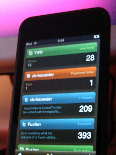
Ego for the iPhone/iPod Touch is one of those pieces of software for me. Some while back I came to this realization—even when sitting at my desk working on my computer where all of my information is accessible, if I want to look at stat for a site of mine, I would rather use Ego. That is one of those great moments I’ve often referred to. If my iPod is not around, getting a summary of my stats is a bit of a pain.
There are two reasons for this: 1) Ego contains all of the information I want to see and 2) it’s a gorgeously designed application. It doesn’t do a lot, but what it does, it does well.
Simplicity should not be overlooked when it comes to software.
When I was young, the majority of my family’s holidays involved long drives and sleeping in our camper. Even when visiting other cities we often found a local RV park and camped rather than any alternatives. Hotels and motels were not a regular occurrence for us. My memories of those trips are all good—kids like to run around and campgrounds are a more suitable environment for that than a hotel lobby.
Now that I’m the parent, I realize how hard it can be to travel with young children and find the appropriate accommodations. Left to my own devices, I would most likely be searching for the local travel lodge and booking some cheesy, fabricated two bedroom motel room. But I’m blessed with a wife who thinks beyond the norm and she has booked us the perfect places to stay for our past two family holidays.
We recently returned from our latest trip on which we travelled to Kelowna BC. Located on the shores of Okanagan Lake, Kelowna is a beautiful mixture of urban landscape and agriculture. Thanks to my wife, we once again had the perfect place to stay.
During her search, she came across A Loft with a View, a loft style bed and breakfast built upon the garage and workshop of Wulf and Joan Gerhardt. Located on the foothills to the southeast of the city, this idyllic place to stay is nestled amongst orchards and vineyards, giving it a wonderful rural atmosphere, while still being ten minutes away from downtown. Their website describes the space in this vein:
At a Loft with a View, you’ll enjoy 1100 sq. feet of bright, spacious comfort and tranquility in a semi-rural orchard setting.
After one week there, we couldn’t agree more.
View
With a name like “A Loft with a View”, the view better live up to the hype. And it does. The deck in this space is located on the north west corner of the loft, giving a full view of the sweeping orchards before you, with the entire city of Kelowna spread before you along the lake.
Kelowna at dusk.
With a view like this, you could spend a lot of time simply unwinding while gazing over the valley.
The Interior
The attractiveness of this space does not stop with the view. The interior and furnishing of the loft are sure to please any travelers. From the Ikea kitchen to the comfortable mattresses, Wulf and Joan have ensured a pleasant experience for their guests.
The kitchen includes a dishwasher and laundry appliances.
Traveling with Children
Any parent with more than one small child knows how many accommodations do not meet the needs of a family. Traveling with small children can be work—hard enough that a lot of people won’t do it, either not traveling at all or leaving their children behind. We want to include our entire family, so it’s important to us to find a space that makes the stay as comfortable as possible.
The loft comes with plenty of sleeping space.
With a couple of bedrooms plus a hidden bed in the living room, the loft here is a great fit for a young family. And with more traditional bed and breakfasts, it can still be a chore to keep the children at an accommodating volume for the other guests in the house (especially during breakfast). But with the loft, you have your own space where you can let your family be themselves.
The Hosts
Lastly, any good b&b comes with hosts that make you feel welcome. The Loft with a View is no exception. Wulf and Joan do a great job of settling you into the space and then making sure you are comfortable for the duration of your stay.
Thanks Wulf and Joan, for a pleasing holiday experience.
If you’re heading to the Kelowna area anytime soon, I encourage to the give the loft a try. Your family will thank you.
The surrounding countryside is a wonderful view, even in the rain.
I’ve always enjoyed getting an insight into how certain companies or people work. Case in point—the design decisions posts by the crew at 37signals. They give their readers a taste for how they work as a team as well as the tools and techniques they use to perform their work. And if you like someone’s work, it makes sense that you would be interested in how they ‘do’ it.
Last week, Michael Mistretta gave an update on where things are with the Fusion Ads network. I want to follow up and give some insight into how we got to where we are today.
What’s in a Name
As Michael mentioned in his article, the original vision for this network was to be a smaller version of The Deck. It was intended to be a Deck-lite or a Deck farm team, where smaller sites who were not big enough for Coudal’s network but produced great content could get their start.
This purpose was reflected in the original name of the project. Some of you may remember The Plank. That vision of a smaller Deck was the reason for that name … “before you get on Deck, you have to walk the Plank.” You get the idea. It got to the point where I had some conversations with Jim Coudal regarding possible collaboration between the two networks.
Nothing much came of those conversations (other than the sense that the majority of the people in this industry are kind, honest, and approachable and Jim is one smart guy), but as you can imagine, Jim was not comfortable with The Plank as a name. It hinted at association of some sort which was simply not the case.
So it was time for a new name, new branding, and a revised vision.
All along our purpose included the ‘small guy’. That intent was originally focused on the content producers, the bloggers we enjoyed who didn’t have big traffic yet. At some point along the way, we came to realize that it would include the customers as well … the advertisers themselves.
We love Mac software and the community that accompanies the industry. It didn’t take long to realize that there was a need for cheaper, quality advertising out there. Not every indie developer can afford a Deck ad. A lot of the advertisers on The Deck are larger corporations with big pockets. We don’t mind promoting those products as well, but we want an ad spot on the Fusion network to be something a iPhone developer can afford.
So when it came to choosing a new name, we wanted one that reflected the entirety of our vision. We tossed a few names around, and finally settled on the suggestion of Fusion by yours truly. Why? According to the New Oxford American dictionary, here’s the definition of the word:
The process or result of joining two or more things together to form a single entity.
That’s exactly what we wanted to be—the joining of the right products with the right readers. The fusion of great software/hardware/services with the people who actually want to use those products.
And we’re feeling pretty good about where we are today and where we are going.
It’s a Small World
Another important theme that has repeated itself over this past year is this: the industry we are serving is smaller than it appears when you are looking in from the outside. There have been numerous occasions where we have discovered that various people we were working with, seemingly unrelated, in fact know each other very well.
This aspect has been key in Fusion’s early success. The entire design/development/Internet-savvy industry is viral in nature, embracing that which is new and fresh, and those involved seem eager to help one another on to success.
We would not be where we are today if it was not for the credibility and reputation of our advisor, Shawn Blanc. Or the popularity and great work of Loren Brichter and Cameron Hunt. Most importantly, we would not be able to do what we do without the careful, deliberate nurturing of relationships of which our publishers do such a good job.
Each of our member sites is a small community in and of itself. And together, all of our sites make one larger group that is attractive to those making products for this community. That is what enables us to do what we do.
Tools of the Trade
It would not be a post on The Weekly Review if software was not involved somehow. I’d like to share a little bit on how Michael and I run the day-to-day business of Fusion.
Our toolbox has changed here and there since we started out a year ago, but several staples have remained. Dropbox is one. iWork is another. And so is Google.
We use a shared folder in one of our Dropbox accounts to manage all of our files. Monthly records, publisher agreements, and advertiser information packages are all there, synced across all of our machines and available at any time due to a great web interface. I cannot emphasize enough how well this utility has served us. There are never any problems and the service never suffers from a lack of connectivity or slowness. It is the perfect collaborative tool.
iWork is the tool we use to create the majority of the files we store in Dropbox. Michael is a Numbers fanatic and has strict standards for keeping his spreadsheets just so. And I think it’s important to mention that our interactions with our customers (advertisers) have been completely compatible even though some of them use that other office software package. You know, from that company in Seattle …
Another nice aspect of iWork is the new web sharing in iWork ‘09. While working on a new document, this feature has been great for having team members preview the file and give input on necessary modifications. One person can create and edit the file while the rest of us simply chime in with our thoughts. It is so great not having to worry about versions.
The majority of our work happens in email and for that we let GMail do all the heavy lifting. Using Google Apps for My Domain, GMail allows us to have multiple accounts forward everything to one inbox that we both manage. Additionally, the ability to access this account on our iPhone/Touch’s means we can pretty much answer our customers from anywhere, which is somewhat of a necessity when running your own business.
There are also several tools that we have recently started using. Two are industry mainstays and come courtesy of 37signals. We had been using Staction for chatting and task tracking, but found that we needed something a little more robust. So we’ve moved to a combination of Backpack and Campfire.
Many people know what a great tool Campfire is. The ability to search through older chats is nicely implemented and a life saver when needed. And Backpack has been a great tool to collect all of our thoughts and tasks is one place and even share with others when needed. Add in the shared calendar and the reminders feature and you’ve got a great tool for running a business where everyone is in a different geographic location.
Running a business is more fun when you have great tools.
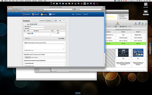
And lastly, after running an ad for Ballpark at the end of April, we had to give this app a try. Previously we were doing all of our invoicing from the PayPal administration interface. This can be described as utilitarian at best … painful would be more honest. Ballpark has made this aspect of the job so much more enjoyable. It is a slick tool and makes communicating with the customer a lot easier.
You can see from this list that our tools are web focused. It’s a necessity when running a business with geographically dispersed team members. What a great time we live in when people from opposite ends of the country can meet and run a company together.
No Means No
The hard part of this job has been saying no. There have been a few instances where we have had to turn down interested advertisers. This is hard, much harder than I would have thought. I have no desire to turn down money or to tell someone that their product is not a good fit for our readership. But there are times when it is necessary. Our primary goal is to provide value to all parties: advertisers, our publishers, and the readers of our member sites. Part of giving the reader a good experience is serving a tasteful ad for a product that most likely is of interest to them.
As well, advertisers are the not the only people we have to say no to. In terms of numbers, for every email receive from an interested advertiser, we probably get ten emails from people wanting to join the network. If we had a dime for every time an email said, “I know Fusion is invite only, but would you consider adding my site anyways?” we would be in pretty good financial shape.
Getting interest from the blogging community is a good thing though—we like getting these emails. It is a sign that we are doing good work. People want a desirable way to earn an income from the work they put into their site and Fusion is an attractive way to do this. But the reality is that we can only afford to pay so many publishers, so it means writing a lot of emails telling interested folks that we are not currently expanding to new sites.
Six months ago, we had no idea how far things would go with Fusion. Today, we’re happy with the success we’ve had … we’re running a profitable business and that’s a wonderful fact in the current economic situation. But we’re not done. Our vision for the future is a lot bigger and broader. Maybe that vision will become reality, maybe it won’t.
But we’re having a good time and we’ll just keep building our business organically, little by little.
It’s also an industry that is quick to move on, abandoning that which was very popular only a short time ago. This gives us a challenge in making Fusion a success in the long term. Six months of growth and bursts of exposure do not a stable business make. But that’s a story for another day … today we celebrate where we’ve come.
Aside from the occasional conflicted copy of a file, which is always easily fixed.
DragThing is a tool that gives you more Dock options.
If people are going to complain about OS X, there are two items that consistently get negative reviews: the Dock and the Finder. I’m not one of those people who feels that either of these applications needs a complete rebuild, but ever since I made the move to the Mac platform, I have had a sense of dissatisfaction with the Dock.
My issue lies in that I for some reason feel the need for the items in my Dock to be organized by the type of work I’m doing. For example, all the apps I use when writing a blog post—it ‘feels’ like it would be more intuitive if they were all together in the Dock. But over the past three years, experience has shown me that no matter how you try, the Dock in its current form is not the tool for the job.
During this time, I’ve tried various other tools to meet this need. The solution that came the closest was a carefully thought out implementation of Spaces. But over time the need to have a few tools used in all Spaces made this feel too clumsy.
There are also a lot of other utilities out there that seem to be attempting to improve this area. Tools such as Hyperspaces and Dock Spaces for example. But after a brief look at each, nothing seemed to work for me.
That was until I gave DragThing a long try.
The Dock Replacement Tool
For those who have used Macs for a while, you may know that DragThing has been a round for a long time. Version 1.0 was released on May 1st 1995, just over 14 years ago. Developer James Thomson describes his application as so:
DragThing is the original dock designed to tidy up your Macintosh desktop.
It puts all your documents, folders, and applications just a single click away. Highly flexible, it allows multiple docks, each customised to suit your exact needs.
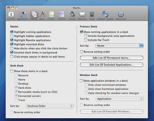
There is no shortage of options in this application.
As you can see, this application has a lot of features, which can be a drawback for some. It takes investing some time to check out all the features and configure your desired docks. But if you are even a little dissatisfied with the OS X Dock, I would encourage you to take the time to try out the various options DragThing gives you.
After several hours of playing with it, I was able to create the Dock experience I had been looking for these past three years.
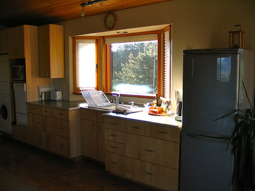
Dock Categories
My desired setup separates two functions of the Dock: an application/document launcher and a process monitor. This is the key issue why OS X’s Dock has never fit my workflow—it combines the two functions together in an unintuitive manner.
With DragThing, the user is able to separate the two functions into different Docks. Or exclude one altogether. How is this done?
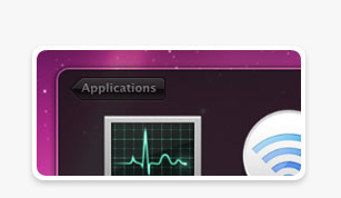
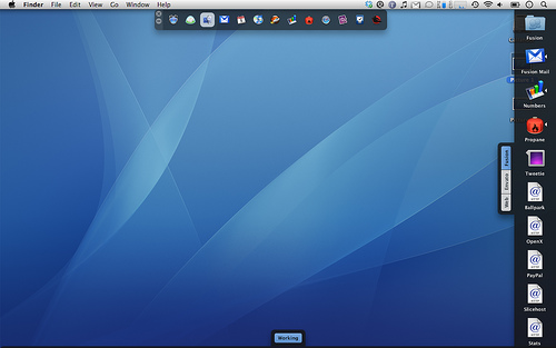
First of all, there is an option to use a Process Dock. You can see this in action in the screenshot at the beginning of the post. It simply displays all running applications. Rather than having a Dock full of open applications plus the applications you’ve chosen to always keep in the Dock plus any documents or folders (Stacks) you’ve added , you only see the applications that are running currently.
Because of my dependance on Quicksilver to launch apps or switch windows, I really only want to see my running applications.
You can then create separate Docks to launch various applications or documents. And this is where DragThing allows you to organize your items by workflow or function. As you can see from the image below, I’ve got a right aligned Dock that has three separate panels, each containing items that are relevant to a particular type of work I do.
All my Fusion items in one place.
This is particularly handy because for some things. For example, for one client I have, the work involves opening up ten to twelve web sites all at once. With this setup, I can create each URL shortcut, drag the mouse to select them all in the Dock and then click Return to open them all at once. It beats hitting CMD + T in Safari and then browsing to each one in my bookmarks.
The other usage I enjoy is creating a Dock with working files. I simply have a Dock at the bottom that I drag and drop files I will be working with onto it. Think of it as a Pending folder for your GTD-minded folks. It’s a temporary location for files in the immediate future.
But the nice part is that files are not actually stored there. Rather, when you complete the drag and drop action, an alias is created to that file. The actual file remains in the same place. You can move that file from folder to folder on your machine, and the alias in DragThing is automatically updated to point to the new location4.
Dock usage is so varied from user to user that it’s inevitable that the default OS X Dock does not meet everyone’s needs and is often criticized. Your Dock needs may be completely different than what I’ve described above in my own setup. But with DragThing, you have the ability and customization available to create the Dock(s) that fits just right with the way you use your Mac.
That’s all you can ask for.
The entire set of screenshots can be seen here.
There are also separate Docks for open windows (Windows Dock) and all disks (Disk Dock).
Of course, you could clear the default OS X Dock of all items so you only see running applications, but then you have nowhere else to group apps or documents to launch.
I find this especially helpful when combined with Dropbox.
We live in a time where it has become extremely difficult to be focused on any one thing at a time. If we are able to achieve this proper focus, lack of proper environment and our own abilities are not able to sustain this focus for long. The disciplines of simplicity and solitude are not practiced by many and I fear we are slowly losing the ability to do so even when a chance presents itself.
“Where shall the world be found, where will the word resound? Not here, there is not enough silence.”
— T. S. Eliot
The enemies of this focus are many. In previous decades, people still seeking quiet spaces complained of noisy telephones, always on radios, and blaring televisions. We still have those today. But now we can add over-burdened inboxes, filled-to-the-brim feed readers, IM’s, tweets, and noisy ringtones to the mix.
But the intent here is not to focus on life in general. Not today. Today the emphasis is on our digital lives. In the list above, a lot of the new ‘noise’, the stimulus that we receive, is present only when we are in front of a computer. Since so many of us spend a lot of time in front of a computer, we are affected by these forms of stimuli.
And there is another item we can add to this list: software. Not just software in general, but newly released software. Betas and 1.0s, the software that drives us away from the perfectly good tool we are using now, to try the newly released, shinier application. Software that looks so good we simply have to try it out, even if we have no need for a tool of that type.
The latest edition of MacHeist really got me to thinking on this. Specifically, some of the commentary and controversy surrounding the highly publicized event helped me to solidify my thoughts on this subject. In particular, Lukas Mathis made some astute observations that hit at the heart of the issue. On the weighing the pros and cons of MacHeist in general, he says this:
Rather than arguing about whether MacHeist is good for the participating developers, or whether it’s good for MacHeist’s customers, or whether it’s a nice experience, or whether the participating developers are getting great marketing, I would be interested in knowing how it affects the Mac software market as a whole.
That is the Question
How does it affect the Mac software market as a whole? Great question. My feeling: it doesn’t help in the long run. Compare the past two MacHeist bundles and you see similar apps from year to year. The second bundle included Pixelmator while the third bundle included Acorn. It’s highly likely there are a lot of Mac users who own a license of each.
And MacHeist is simply some shrewd marketers capitalizing on this truth—current day computer users have software A.D.D.
Our fast paced society and our penchant for ingesting more input than we can handle has affected the way we use software. Many of us seem eager to try whatever is the newest, despite the cost of moving from one tool to another. No longer are we experts in our favorite applications, simply because we do not use our applications often enough or long enough. Giant software bundle sales take advantage of this fact.
We Can Change
The Mac community seems more vulnerable to this mentality. But it’s not the entire community. There are the power users out there, experts in their field who use certain applications every day in plying their trade. Take John Gruber for example—any regular reader of his site knows he’s been using BBEdit for years. It’s safe to say that he knows the application inside and out.
I want to become an expert in my favorite software applications. That only happens when you focus on doing your job—whatever that is—and forget about the applications themselves.
And we are back to focus.
The GTD craze of the past couple years is perfect evidence of this mentality.
Possibly due to the fact that the Mac platform has a virtual cornucopia of good software available compared to the Windows community.
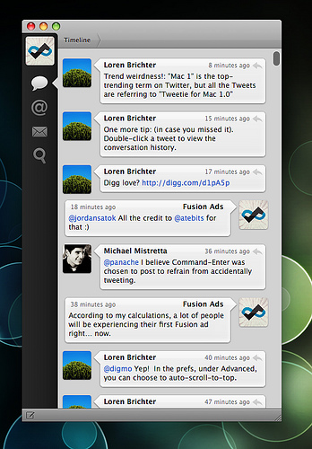
Well, the big day is finally here. Today is the launch of Tweetie for Mac 1.0, Loren Brichter’s desktop version of his Twitter client.
I remember when I first heard about Tweetie for the iPhone. A lot of people were saying that it was a game changer, that it was the best Twitter client for the platform. It didn’t really mean much to me as I was cutting back on my Twitter usage anyways and did not see the need to pay for software I wouldn’t use.
But when Fusion entered into talks with Loren about running ads on a free version of Tweetie, Loren offered us copies to try out. And I kid you not—within the first ten minutes of playing with the application, it became readily apparent that this was a better Twitter experience than any local client or web service I had used so far. I was blown away at how intuitive Loren had made the interface and how easy it was to move your way quickly through related conversations and then get back to your personal timeline.
Here we are several months later and Loren’s Tweetie version for OS X is available and serving Fusion ads. The good news—Loren is an amazing developer and the desktop version is even better than the iPhone version. As with Shawn, my favorite feature is easily browsing through an entire conversation. And even better than the mobile client, getting back to your timeline is only one click, where as on the iPhone version is can be multiple clicks away.
Blue means new tweets.
As well, I really like how the menubar icon lights up when there are new tweets available (as seen on the right).
The bad news? There is none. And impressively, although the launch was less than two hours ago, there are already some ways to improve your Mac’s integration with Tweetie. My love for the Mac community is in full bloom.
And as good as this 1.0 version is, from what Loren is saying, there are even better things to come.
I operate on the assumption that there comes a time for every blog writer where he/she questions whether a topic of interest is suited for his/her current audience. It is certainly true for me and it’s the reason for today’s post. When this situation occurs, the first question I ask is this: do I need another space to write on this topic? For me, the answer is now “Yes.”
Changes
I have a couple of changes I’d like to tell you all about. First, the direction for this space has altered slightly. Since its inception, The Weekly Review has focused mostly on software, web design, and personal productivity. The focus now will be on the first two. I haven’t spent much time on GTD or other characteristics of the personal productivity genre in recent times and I don’t see that changing.
In addition, posting here will decrease. No longer will I be posting a lot of links, quotes, or shorter opinion pieces. Instead, my focus here will be on longer articles regarding software, the web, and design behind both. I feel that the name The Weekly Review well suits this kind of discussion.
The second change is this—I’d like to announce the launch of my new personal site. This is where I will post more frequently and give a more personal glimpse of my life and my thoughts an many different topics.
Reasoning
Several factors have lead me to this path. I’d like to share them with you:
Content: Most importantly, there have been those moments I mentioned at the top. I’ve had the desire to write about topics such as parenting, nutrition, or the environment. And much more. This space did not feel like the right place for that material, nor did the timing feel right.
Domain: I’ve owned the domain name chrisbowler.com for some time, and I have been itching to put it to use.
Tumblr: I’ve been intrigued by Tumblr as a platform over the past year and have wanted an opportunity to design a theme and dig into the inner workings of the CMS.
Branding: When it comes to personal branding, I believe this is the right sort of move to help me fulfill my dream of earning my full time income via the web.
So there you have it. If you are a regular reader or subscriber of The Weekly Review, I hope you’ll give the new site a chance as well. Subscribe if you like. If you’re just interested in thoughtful analysis of well written software, stay right where you are. There’s more of that to come. If you have any questions or comments you’d like to send my way, please do so.
Thanks to everyone for reading here over the past year.